Friday, July 29, 2011

Don't Talk While Posing, and Other Lessons Learned

I am *so glad* we did an engagement shoot with our amazing photographers before the wedding.  Not just because I love the pictures we got, but because it gave us an opportunity to see what it's like to have our own personal paparazzi for a few hours.  What looks easy from the outside (stand still, smile) was actually pretty hard work (stand still for a long time, now sit at an awkward angle, giggle, now be serious, oops too serious).

all photos by Paco and Betty

The preparation of picking the outfits and getting ready and all that was a bit of a fiasco unto itself, but the most important things I learned were things I realized during and after the shoot.  For instance, who knew that something as awkward as getting your picture taken in public (sometimes in compromising positions!) could feel normal after about an hour, or that it's physically tiring to smile for extended periods of time, or that I am virtually incapable of keeping my mouth shut for more than a few seconds?!


And there are definitely a few things I want to remember going into our wedding day (besides not talking while posing - I got it!).  I want to remind us both to do more looking at the camera - at the same time.  There are only a few pics of us like this because we're either looking at each other, one looking at the other, or both looking away. Not to brag on ourselves too much, but our eyes are kinda amazing so I want to make sure I have lots of options of pictures where they really stand out. 


As the sequence of pictures go on, I can see the frizzies and dark circles starting to creep in ever-so-slightly, which reminds me that I want to be sure I take time to freshen up my hair and makeup at some point during the night.  And I want to remember to stay relaxed.  Our least favorite pictures are the ones where we felt most awkward, and our favorite pictures are ones where I know we weren't thinking, "How does this look?  Am I doing this right? What did they say?"


Another lesson learned - giving up control, and I'm not talking during the shoot (although that's certainly true as well).  I mean giving up control of what images come back to us.  For our engagement shoot we received 115 images taken in a little under 2.5 hours, which I know logically is more than enough.  But since I'm a volume shooter when I take pictures, I'm used to coming home and sorting through hundreds of images all taken in a pretty short time span.  If I don't quite like a facial expression or detail in one or three or five images I've taken, there's a good chance I've got at least another five still to choose from.  But pro pics don't work that way, so I needed this engagement shoot experience in order to be more realistic in my expectations about how many wedding day images I'll get to look at.


And lastly, though most importantly, I want to remember that everything won't work out exactly as planned and yet all will still be perfectly wonderful.


What lessons did you learn from your experience(s) being photographed?  Let's add to this list!

*all photos in this post by Paco and Betty

Tuesday, July 26, 2011

White Knots for Equality

Marriage equality is an *extremely* important topic for the Ferris Wheels. In fact, our marriage talks began back when California legalized marriage for same sex couples because, at the time, we were a same sex couple. We knew we wanted to get married, but we were both still students and the timing just wasn't right for us yet. Unless you've been in this situation, it's impossible to explain what it feels like to consider rushing to get married because you're afraid you'll never again have the opportunity to legalize your union with the person you love. In the end we decided to wait until we were ready, even if it meant that our relationship wouldn't be legitimized by state and federal governments.

Unlike most other queer couples, we're now able to access the institution of marriage because of Mr. FW's gender change. We wrestled with the politics of our decision to get married, and we remain steadfast in our belief that all loving and committed couples deserve to be treated equally in the eyes of the law. We will openly talk about this belief during our marriage ceremony and we wanted to give our guests a way to visibly show their support of marriage equality as well. Enter white knots for marriage equality.

In our ceremony program we plan to include a page with the white knots and a description of their meaning.


Compared to how much this issue means to us personally, the supplies to make these were ridiculously affordable. We bought everything on eBay - 10 yards of 3/8" white grosgrain ribbon, 100 tiny plastic bags, and 144 small safety pins for a total cost of $11.60. The process of making them was equally as simple.

{5 easy steps, not including the step where I heat-singed the notched edges of the ribbon}

We hope that by including these knots right in the ceremony program people will have ample time to read the information, make a decision for themselves about whether or not to wear them throughout the rest of the night, and maybe even have conversations about the fact that we included them in the first place. And really, that's what it's all about.

How are you incorporating your own beliefs (cultural, political, personal, or otherwise) into your wedding day?

Thursday, July 21, 2011

14 Hours and Counting (The Invite Madness Begins)

I've been trying not to notice the time, but having typed out that sentence I just couldn't help but steal a glance at the clock on my computer.  It's 3:24 a.m. and I'm wrapping up my wedding planning for the night.  By my sleep-deprived estimation I've spent at least fourteen hours today on my computer - each and every one of those hours dedicated to brainstorming and drafting ideas for our invitations. 

Luckily for me, we've finalized some of our other paper products and that gives me some stylistic direction for the invites.  Unluckily for me is that I can't visualize ideas. Either that, or I don't trust my visualizations. Whatever it is, I'm a person who has to make a prototype or create a digital mock-up or *something* before I'll have the slightest clue whether or not I like a particular idea. I don't need it to be pretty - just something that gives me a rough idea of what the end product might look like.  Also terribly unfortunate for me is my relative lack of skill with graphics programs, meaning that I'm constantly googling "how to do ____ in Photoshop Elements." 

Key words: rough, lack of skill

That's how I wind up with my computer desktop chock full of icons (and I hate a desktop full of icons!) for a zillion different versions of images like this. 

{amidst this craziness, a little sneak peek of our engagement pics!}

I can't believe I'm actually posting a picture of my work in progress, but there's your window into the way my mind works.  Chaotic, no?  As hard as it might be to believe, that craptastic illustration is where all the magic starts for me.  In case you were curious as to what you're looking at, that's a potential layout for a 5x7 pocketfold.  Starting on the left we have a (horribly rendered) pointed flap lined with stripes, leading to the main invite in the middle (where you can clearly *ahem* see where the words and the graphics go, right?), and the enclosures in a pocket on the right-hand side that's also lined with stripes and may potentially feature a photo of us. 

No doubt I would've done a similar layout even if we were going to order our invites from a printer, just because it gives me a chance to see how everythings fits together.  But because we plan to DIY them, laying out all the individual elements like this gives me an opportunity to think about how each part needs to be made, what's feasible and what's not, how they'll have to be layered and adhered, what supplies we'll need, etc. 

It also gives me ample time to consider the likely possibility that we've bitten off more than we can chew here.  SO many individual parts.  SO many steps to put it all together.  SO little time to get it all done.  And ALL that for something people will just throw away.  I don't know why this is so important to me, except to say that it is.  I cherish the way Mr. FW and I collaborate on creative tasks like this (even if we drive each other crazy sometimes), and I love the idea that when it's all finished we'll have this amazing memento we made with our own hands. 

That said, we're not even done designing them yet and already I can't wait to cross them off the list! 

What project did you or will you take on, knowing full well it's probably more than you can reasonably handle?  What's YOUR explanation for that?

Monday, July 18, 2011

The Evolution of Inspiration

Are you ready to hear something utterly, mind-bogglingly unbelievable?  It's the kind of ridiculousness I can only assume applies most often to intense planner-types like yours truly (but if it extends even further, I'd love to hear about it).  Just what is this ridiculosity?  Well, while searching through my wedding files the other day I came across an inspiration board that I made, and the creation date on the file is...

...wait for it...

May 30, 2009.  Just let that sink in.  Count the months.  Do the mental math.

Umm... yeah, that's more than two freaking years ago.  How *crazy* is that?!  No lie, no exaggeration - Mr. FW and I made this inspiration board a full-on year before we got engaged.  Yep, you heard that right - wedding style first, engagement ring second.  Just for kicks, let's take a look at that wedding style, shall we?

{my sincere apologies that I don't recall the sources for any of these pictures}

Looking back on this board, I gotta say that I'm incredibly proud of us (and mostly me) that we've managed to keep the same basic color scheme for more than twenty-four months now without changing our minds about it. Obviously, though, two years is a really long time to hold anything constant and it's clear to me that our overall aesthetic has veered towards a more modern, monochromatic look.  For instance, there's a lot about this board that still makes my heart skip a beat (attire, anenomes, mix-and-match black/white patterns), but the Moroccan-style lamps, feathers, white linens with blue sashes, ornamental cake decoration, and the more general paisley theme are all items that have hit the cutting room floor. 

We've changed in the last two years, our preferences have changed, and our wedding has changed right along with us.  Which is a good thing, right?  I'm so very thrilled with the wedding that lives in my head right now, and the wedding that's materializing with every new project we complete, that I hope it doesn't go through many more changes in the next few months. (That, and I honestly don't think I could take it!)  But since I'm pretty sure I won't be making another inspiration board, at least I won't have photographic evidence of any changes that do happen.

How did your wedding style evolve over time?

Wednesday, July 13, 2011

Me and My Twin, Nancy

Now that I've got The Dress I'm feeling some pressure to finalize my wedding day look, and I'd like that to start with my hair.  As y'all know, I have relatively long curly/wavy hair.  What you may not know is that I wear it down almost every day and I don't tend to prefer pictures of me where my hair is up.  Obviously that means I plan to wear it down for the wedding, but I want it to look more 'special' than just my everyday hairstyle. 

And then, a few days ago, the most amazing hair inspiration appeared to me in a completely unsuspecting and fortuitous moment.  While Mr. FW and I were engaged in a marathon session of wedding crafting, we were watching a fabulous little show called Weeds.  All of a sudden I happened to notice that Mary-Louise Parker and I share a similar hair texture.  Not only that, but her character Nancy Botwin and I appear to share a mutual love of the half up/half down hairstyle.  And the particular look that caught my eye was this beauty.

{I could only get a blurry capture of the back.}
screen captures from Weeds Season 5

It's somewhat difficult to tell from the pictures, but she's wearing a thin sparkly headband and it looks like in the back her hair is secured with a loose twist.  I was so smitten with this look that I quickly clicked through other episodes to see if I could find anything else that appealed to me as a possible wedding 'do.

{Sorry for the harsh light/contrast - dark hair and dark background is a tough picture to capture.}
screen captures from Weeds Season 5

I'm not-so-secretly hoping that the first style looks as smashing on me as it does on her.  Just in case, I plan to bring those other two images with me to a hair trial so I can try out a few different options.  Who knew I'd be so giddy to mimic the styling of a suburban pot dealer...

Have you (intentionally or not) turned to Hollywood to inspire your wedding day hair?  If so, who's your celebrity hair twin?

Monday, July 11, 2011

The Gendering of Flowers

Having now shown you our ribbon boutonnieres, I have a confession to make:  I'm conflicted about the way we've gendered the floral elements for our wedding party.  By this I mean the tradition of those in dresses carrying bouquets and those not in dresses wearing boutonnieres.  Even though this is exactly what we've chosen to do, I gotta say that the assumed gender segregation of this situation really irks me. (I say 'assumed' gender segregation because our wedding party doesn't actually break down into women = dresses and men = pants.) 

Any time there's a tradition or common assumption about the way something "should be" done or the way it's "usually done," I'm the kind of person who's going to question the hell out of that assumption before I make a decision for myself.  (True in life, true for the wedding.)   Just what is it that bothers me about flowers?  It's the way they get equated with femininity.  It's the expectation/assumption that women are supposed to like flowers and men are not.  It's my awareness that every time I, as a feminine person, appreciate the beauty of flowers I am simultaneously reifying the assumed gender binary.  ("She is feminine and she likes flowers.  Further proof that flowers are feminine.")  I think the social construction that says women can be gifted bouquets and men probably shouldn't is the same thinking that creates a wedding world where women carry bouquets down the aisle and men go down empty-handed, sporting only a small hint of a flower on their lapel.  When I really think about it, that seems like a relatively arbitrary distinction.

{arbitrary, but lovely}
image via Ruffled; photography by Katie Day

I was feeling pretty invested in violating the norm on this one, so I looked around to see what non-bouquet options existed out there.  There are a fair number of weddings I found where people are skirting the flower issue (it's a pun!) by using floral alternatives.  I even had a brief flirtation with the idea of lanterns, as inspired by this picture.

image via Rock the Diamond, photography by Elizabeth Ray

But after seeing it Mr. FW said, "We're not really lantern people." And even though I don't totally know what that means, somehow I knew he was right. I've searched high and low to try and find pictures of weddings where the wedding party members either all carried nothing or all carried the same thing, and I've pretty much come up empty-handed. (Another pun! Tired of me yet?). It seems that in nearly every image I've seen, the floral alternative item is still only carried by the women in the wedding party.    


image via Green Wedding Shoes; photography by oh, darling!

We kicked around lots of options - books, portfolios, bowls, bouquets for everyone, nothing for everyone, letting people choose their own item, etc.  Nothing we could come up with really resonated with us.  Now, here's the part where I acknowledge the seemingly hypocritical aspect of all this.  The truth is, I like the look of wedding party members carrying flowers and wearing boutonnieres.  

 
image via Bouquet Bridal

 
image via Alliwell Studios; photography by Ellie Grover

Eventually I had to ask myself whether it was worth it to choose an item I didn't like as much as the bouquet/boutonniere combo JUST to make a statement about equality and the (in my opinion) absurd gendering of flowers.  Because sometimes making a statement is absolutely worth it to me, whatever the cost.  But in this instance my answer was no. 

As I see it, the beauty and importance of incorporating an egalitarian analysis into our wedding (and my life) is that I have the freedom and the responsibility to think about the traditions, power dynamics, history, social implications, gender/sexuality assumptions, and implied messages inherent in these issues and then make an informed decision for myself.  This way I know I'm not just choosing bouquets and bouts because "that's the way it's done."  I'm doing it because, after considering all the options, I (and we) have determined that this is what's best for us.  That's a decision I can be proud of, even if I remain somewhat conflicted.

I'm curious - are there any wedding decisions you've felt conflicted over?  What do you think about wedding party members all carrying the same thing or nothing at all? 

Friday, July 8, 2011

Dressing Inanimate Objects

What inanimate objects get dressed up for a wedding? Tables and chairs, of course!

                                                       Naked                                                                   Fully Clothed

                              image via jumpandparty.net                                                  image via 88 Events Company     

And in true Ms. Ferris Wheel fashion, I have decided to make this infinitely more difficult for myself. Would you believe me if I told you that white or ivory floor-length tablecloths AND chair covers are INCLUDED in our wedding package?! Of course you'd believe me. Why would I lie to you about something like that? I wouldn't.

So now I know you'll also believe me when I say that I (oh, I of the "anything to make my life more complicated" mentality) will not be utilizing white or ivory floor-length tablecloths OR chair covers for our wedding reception. And why is that? Well, basically because I'm a moron with a sadistic streak. That, or I've fallen victim to the gorgeousness that is images like this.

image collage via Green Wedding Shoes; top photos by Aaron Delesie via Style Me Pretty;
bottom photos by Jose Villa

image via Green Wedding Shoes; photos by Lisa Lefkowitz


photo by Geoff White


The ribbons say "fun" and "handmade" and "unique," while the gray tablecloths say "different" and "modern" and "I coordinate with your wedding colors." I am a sucker for ribbons and for all things gray, so why not give them both a starring role at our wedding reception? Besides, we're just not fans of white chair covers and white table linens. For one, it's a little bright given that we're aiming for a City at Night feel. For two, it's a little Traditional Ballroom Reception for our taste. Yes, it's a little extra money for something that we otherwise wouldn't have to pay a penny for - I get that.  But I plan to go on the *cheap*cheap*cheap* with this project, which makes it much more do-able.

I'm still sourcing table linen purchase/rental options, so I'll have to get back to you about that. But we have finalized the ribbon portion of the project. A few months ago Mr. FW and I went to Michael's and went nuts in the ribbon section. I wish I had a picture of me accidentally unrolling 2 spools of ribbon all the way down-and-out the aisle while Mr. FW chased after. Alas, all I have to offer you are these pictures of our painstakingly chosen coordinating ribbons hanging off a hanger against our gray bedroom wall.    


I know, I know.  It doesn't look as fully and breezy as those ribbon images above, but we thought a more minimalist approach better fit the vibe our our wedding,  Plus, having fewer ribbons means we kept our expenses lower AND we increased the chances that whoever has to tie these ~320 knots will only want to kill us one-half or even one-third as much as they would have otherwise once we tell them this is the task we've assigned to them. Mwahahahahaaaaaa!

The black, silver and white ribbon are coming from COD Wholesale, where I paid $53 (including shipping) for 200 yards each of 7/8" double-faced satin ribbon in black and silver, and 5/8" double-faced satin in white. Then I found the black with white stitched grosgrain ribbon at papermart.com, where 125 yards of 5/8" ribbon cost $20.  Total ribbon cost: $75, or right about $1/chair. With this much ribbon I'm ensuring that we have more than enough for the chairs plus plenty of leftovers for other crafts potentially needing a ribbony touch. Now that all of the ribbon has been cut, ironed, "collated," and is hanging and ready to go in our basement, we're pretty darn pleased with ourselves.   

Is there anything you could have gotten for free, but you decided to spend extra money anyway? Please tell me I'm not the only one...

Random Facts and Cocktails

Way back in the day when I first saw a blog post about cocktail napkins personalized with fun facts, I immediately shared the idea with Mr. FW and we both thought it was genius!  I mean, who wouldn't love to go to a wedding and learn a little bit about the couple every time they grab a drink? 

{and it looks SO much better when I don't have to remove our names. *sigh*}

Before I get to the tutorial, a few caveats. #1: I shamelessly stole the layout design from Mrs. Cupcake, so I want to give full credit where it's due. #2: I used a Gocco for this, and the materials for Gocco have gotten crazy expensive since they're no longer being manufactured. I'm sure there are other ways to do this such as the Yudu, but I have no experience with it. #3: I avoided this project for a while because I worried it wouldn't work and/or that it would take too long, but in actuality it took me about 2 hours to lay out the design, less than 30 minutes to burn the screens, and about 2 hours to print the napkins. That was it! Seriously my shortest project yet.

First step: Get the image ready for the Gocco. I used Photoshop Elements to lay out the design, and I sized each fact to be less than 3.5" by 2.75" so I could preserve precious Gocco resources by fitting two facts on each screen. Once printed, the design needs to be photocopied so that the image will be carbon-based (which is what the Gocco needs in order to burn a screen). I used the "artwork clean-up method" to "remove excess carbon" from your copy, and all that means is I put a piece of parchment paper on top of the copy and then I ironed it. I have no idea if this helps or not, but I wasn't taking any chances.

Second step: Burn the screens. I used a white 4x6 piece of paper on top of the Gocco pad to lay out the two facts I wanted to burn on the screen. Slide the blue filter into the Gocco first (because you're burning a photocopy), then the unburned screen. When you close the lid you can look through the window to ensure the layout looks the way you want it to. If everything looks good, insert your bulbs into the bulb housing and lower the housing onto the top of the Gocco. Recruit your partner to do the exciting work of pressing down firmly on the lid of the Gocco until you see a flash. Remove the bulb housing and be sure both bulbs flashed. (They'll be brown and hazy.) When you raise the lid, you'll see that the image is now stuck to the screen. Carefully peel it off and admire your burned screen.


Third Step: Prepare the screen for printing. When I looked closely at my screen, I saw a tiny area where the screen hadn't properly burned away. You'll be able to recognize this because part of your image will still be shiny rather than matte. In the image below, see how the leg of the M isn't burned? You can fix this by oh-so-carefully using a straight pin to scratch away the coating.


Raise the clear sheet and apply ink block to the screen. Ink block is supposed to keep one color from bleeding into another, but I also use it to save ink by keeping the ink from spreading out too far. So I just wrap the ink block around the image and through any unused space. Now choose your ink color. We spread some potential ink colors onto one of our blue cocktail napkins to get a sense for the contrast level between ink and napkin. Although I thought we'd love the grays, we ended up choosing the black and I was really happy with how it turned out.

Before you load your ink onto the screen, put your screen on a scrap piece of paper so the ink doesn't bleed through onto your table. Then spread the ink evenly over your image and lower the clear plastic cover. Insert your screen back into the Gocco with the plastic cover toward the top window of the machine. Put some scrap paper onto the Gocco pad and press down firmly on the front two corners of the lid to make a test print. Now is the time to make any needed changes - add more ink, spread out the ink, figure out what kind of pressure you need to use for your particular combination of ink consistency and paper absorbency. Then you're ready to move onto the real thing.


Fourth Step: Line everything up to make your print. My Gocco PG-10 has a registration plate and a moveable print pad, which I find extremely useful. The registration plate is basically just a piece of plastic that snaps into the machine. You stamp your image onto the plate, then put your paper (or napkin) under the plate and move the printing pad around until everything is centered/lined-up the way you want it to be. At that point, you want to make an L shape out of something sturdy (I used the cardboard sides of a tissue box) and stick it down to the adhesive plate along the corner of whatever you're printing. This will allow you to easily place your paper in the same spot for each print, and I promise it will save you a lot of time when you're printing hundreds of items back-to-back. Once your L guide is in place, you can remove the registration plate and begin printing.


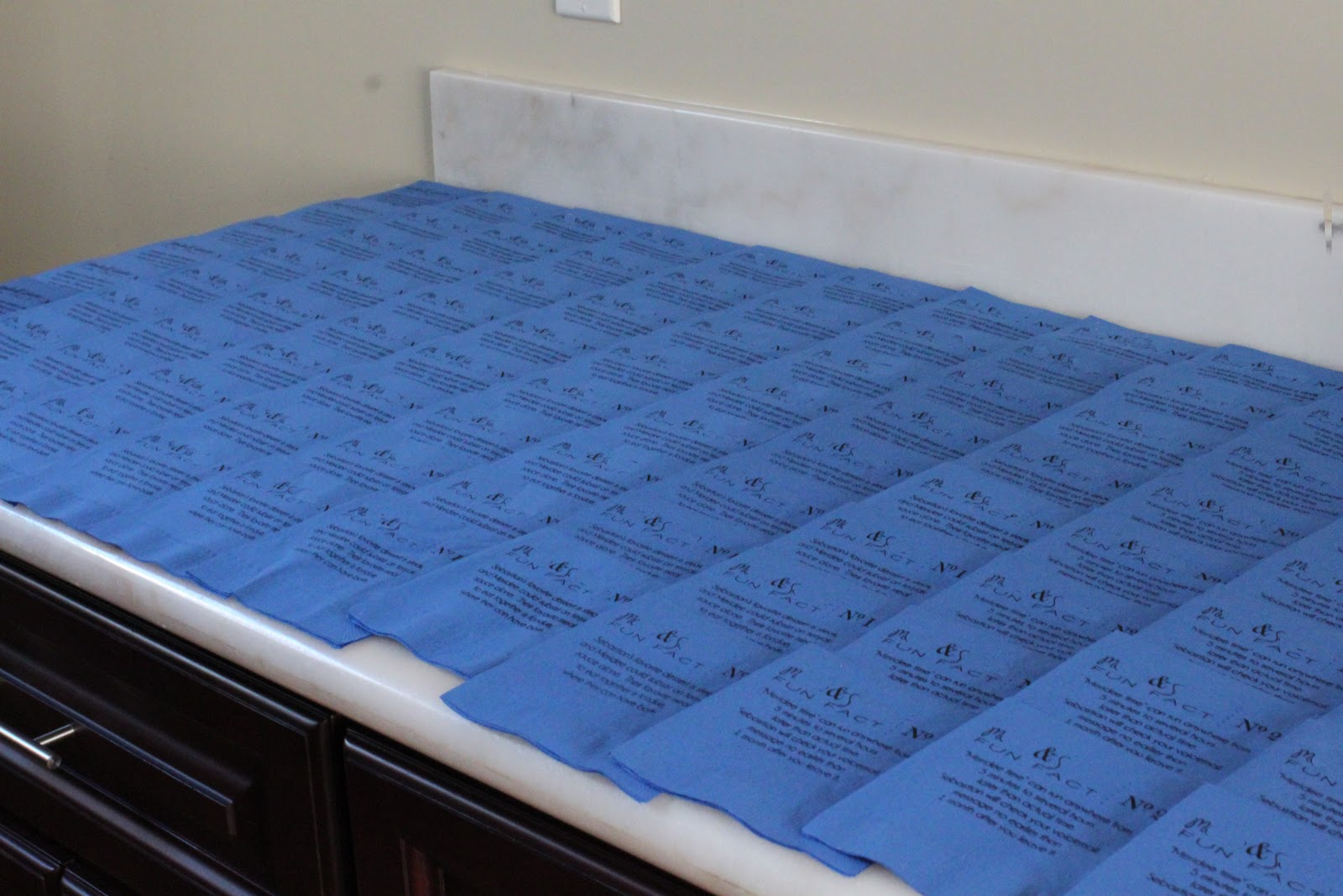
Fifth Step: Print your image. Happily begin printing away. If you're printing napkins, as I was, you'll need to reach under the lid and hold down the top layer of the napkin as you open the lid otherwise it will stick to the screen and smear your ink. Continually check the quality of your prints so you can tell when to re-ink the screen. Either you'll notice the ink getting much lighter or there will be places that don't print at all. Be sure to have a lot of space available for drying. The prints shouldn't be stacked for at least 24 hours to be sure they're completely dry. When you're ready to switch from one fact to another, take the screen out, lift up the clear plastic sheet, scrape off the excess ink and transfer it to the new area you'd like to print. You can then cover the old fact with sticky notes so they can be easily removed later if you want to reuse the screen.


Sixth Step: Clean and store your image. Apply Gocco screen cleaner and wipe with a (million) paper towel(s) until you can readily see light through all of the burned parts of the image. Then you can safely store the screen in case you need to print more of your design at some point in the future. For us, this is helpful in case we have more RSVP's than we expect.


Sorry for the long post, but I know that before striking out on my own I read a lot of Gocco tutorials and I preferred an overabundance of details rather than too little information. Feel free to let me know if you have any questions. I'm no Gocco expert by any means, but I'm happy to share what little knowledge I do have - because everyone should get a chance to be this giddy about cocktail napkins!  Let's hope our guests love them even a tenth as much as we do.


So tell me, do you have a Gocco? What projects do you use it for? What questions do you have?

Tuesday, July 5, 2011

About the Bouts

This long holiday weekend saw the completion of phase one of what I'm dubbing Project Floral Creations.  (Have I mentioned that we aren't using any real flowers in our wedding?  Well, we're not.  And now that I've remembered to inform you of that, this post is gonna make a lot more sense!)  The list of florals that need to be created isn't all that long, but it's felt really daunting because I assumed that everything would take a long time to complete.  And if phase one is any indication, I was absolutely right about that.  Thankfully I'm super pleased with the final outcome.


In case you couldn't tell (and I hope that's not the case), these are our boutonnieres.  Over a year ago I saw an inspiration picture of grosgrain ribbon flower bouts and I thought the idea was fabulously fun, chic, and totally DIY-able.  Mr. FW agreed and thus the plan was born.  The steps were all pretty simple, but because I'm meticulous to a fault they each took an inordinately long time.  In case you're interested, here's the step-by-step.


First you stitch down one side, either with the sewing machine or by hand.  Knot the thread on one end and then pull the string on the other end (or one of the two strings, if you're using a sewing machine) until it gathers by an amount that will work for the size of the ribbon and the shape of the flower you're trying to make.  Then you simply knot off the other end to hold the gather.


Hot glue one end of the gathered ribbon to the other, forming a (sometimes wonky-looking) circle.  You're then going to hot glue a piece of felt to the back of each flower to hold the shape and to make it more sturdy. 


Now for the flower centers.  I know a lot of other people use buttons or beads, but we wanted a more substantial center that wasn't visibly button-like.  I considered using buttons with shanks on the backs, and they would've been infinitely easier.  But they were also more money than I wanted to spend and I knew tissue paper could give a similar look, so I went that route. 

To do this, you start with a tissue paper ball roughly the size of the center you want.  Bury the tip of your floral wire inside this ball and then wrap one or two layers of smooth tissue paper around both of them.  Use floral tape to secure the tissue paper. 


Make a hole in your felt center that's large enough to accommodate the tape-wrapped stem, then use a little hot glue to secure the ribbon flower onto the tissue paper center.  To complete the look you can use some needle-nose pliers to bend the stem down.  Then step back and admire your finished flower.


For Mr. FW's bout I incorporated a glass tile with a picture of his/our dog, Patches. I just needed to build up the center of the flower with some additional felt before I attached the tile with hot glue. My/our dog Eli has a matching tile that will probably be featured on my bouquet. This way we can have the dogs with us on our wedding day, even if they can't be physically present.


To put everything together, just bend the stems to place the flowers where you want them.  A thin floral wire will secure them while you work.  (In this picture you can see the two different kinds of backs I used - one as described and one where I just sandwiched the stem between two circles of felt.  For that method I glued the tissue paper balls onto the center.  Neither method was necessarily easier or faster, so just do whatever you prefer.)  After everything is wired together exactly as you want it, you can give your bout a finished look by wrapping the stems with (more) ribbon and securing that ribbon with (more) hot glue.

And now we can cross that project off the list!  Woohoo!  Let's hope this recent craftiness is the beginning of a Project Floral Creations momentum streak - that way I'll be a little less stressed about our neverending to-do list, AND I'll have lots more to show you soon. 

Are you using any floral-alternative elements for your wedding day?  If so, are they DIY or something you're purchasing?