Okay, enough with the words. On to the pictures!
{envelope back}
For no particular reason, let's start with the back. It's difficult to tell from the picture but the spirograph is embossed on there, creating that amazing glossy, raised look that only heat embossing can give you. You can also see the bow of the baker's twine that's wrapped around the pocketfold.
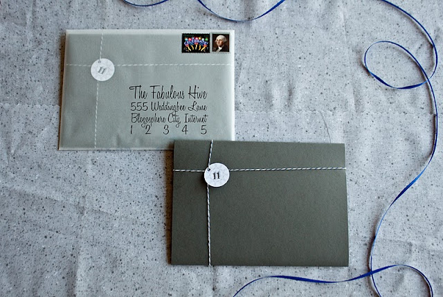
{envelope front and the wrapped pocketfold that goes inside}
If you've been around the hive long enough, you'll notice right away that I drew significant packaging inspiration from Mrs. Apple Cider's invitations. Like her, we addressed the vellum envelopes by running them through our inkjet printer and it worked just fine. Oh, and one more thing... I just have to give a special shout-out to those celebration stamps because Mr. FW and I are obsessed with their awesomeness. (Side note: we also like to say that our stamps read "celebrate George Washington." Silly!)
{our logo}
Mr. FW created this sleek logo for us that somehow manages to incorporate so many of our elements - spirograph, wedding date, ombre ink effect - into a little one inch circle.
{open pocketfold}
When our guests unwrap the baker's twine and open the pocketfold, this is what they'll see. To walk you through it, there's our striped "liner" (printed at home on semi-gloss paper) on both sides, the matted invitation (printed on the Gocco), four inserts (printed on our printer) with a design that lines up along the right hand side, and of course a picture of us. The part I adore most about the invitation itself, and that you can't see because I removed our names, is how only our names and the word "love" are highlighted by the blue text. Aww...
{all of the inserts taken out of the pocketfold}
When our guests take out the inserts they'll find cards for accommodations, map, more information, and RSVP (both front and back pictured above).
{accommodations insert}
Our accommodations card offers brief information about how our guests can reserve rooms at the venue and points them to our website for other hotel information. I am so in love with this little card - from the spirograph in the center to the fading ink for the text. *Swoon*
{map insert}
Mr. FW created this map insert from start to finish, and it's a great example of what an excellent team we are. This is not anything I'd know how to do, nor do I have even have the programs for it. So he did all of it and then we just dropped it into my layout. How adorable is that little blue star?!
{more information insert}
We needed to find a way to let guests know all of this additional information that we didn't want to squeeze onto the invitation, so we gave it its own card. The only thing I didn't remember to include was suggested attire, so I hope people actually do check the website and see that we're going more for cocktail attire than black tie. I guess we'll find out soon enough.
{RSVP postcard - of course the final ones actually had a stamp on them}
I really enjoyed designing the RSVP card. I wanted to make them fun while also trying to increase the chances that they would serve their primary funcions - tell us who's coming and what they'd like to eat. Skipping the M____________ blank that even I still don't totally understand, I labeled the name blank with the oh-so-helpful word "name" and put pictures of the entree choices right beside it. (But just in case, we did also use an invisible blacklight marker to number each of them.) Instead of accept/regret options, I used the words "yay" and "boo" because those are things we actually say all the time. The hotel information will help us to distribute the out of town bags, and if people list a favorite song then we'll try to include it in our playlist for the night. According to our current count, we will have at least 13 guests at our wedding. :-)
{ready to go out into the world}
In designing this suite I found out that it's not easy to make predominantly black, gray, and white elements look special or artistic, especially when you're just going to print them on a regular inkjet printer. But as we started to put all the pieces together, it really felt like we achieved exactly the look we were going for. Yay!
Would you ever make the crazy and yet absolutely worth it decision to design your own invitation suite? If you have any questions about how we constructed anything, feel free to ask!
Would you ever make the crazy and yet absolutely worth it decision to design your own invitation suite? If you have any questions about how we constructed anything, feel free to ask!


No comments:
Post a Comment
Note: Only a member of this blog may post a comment.